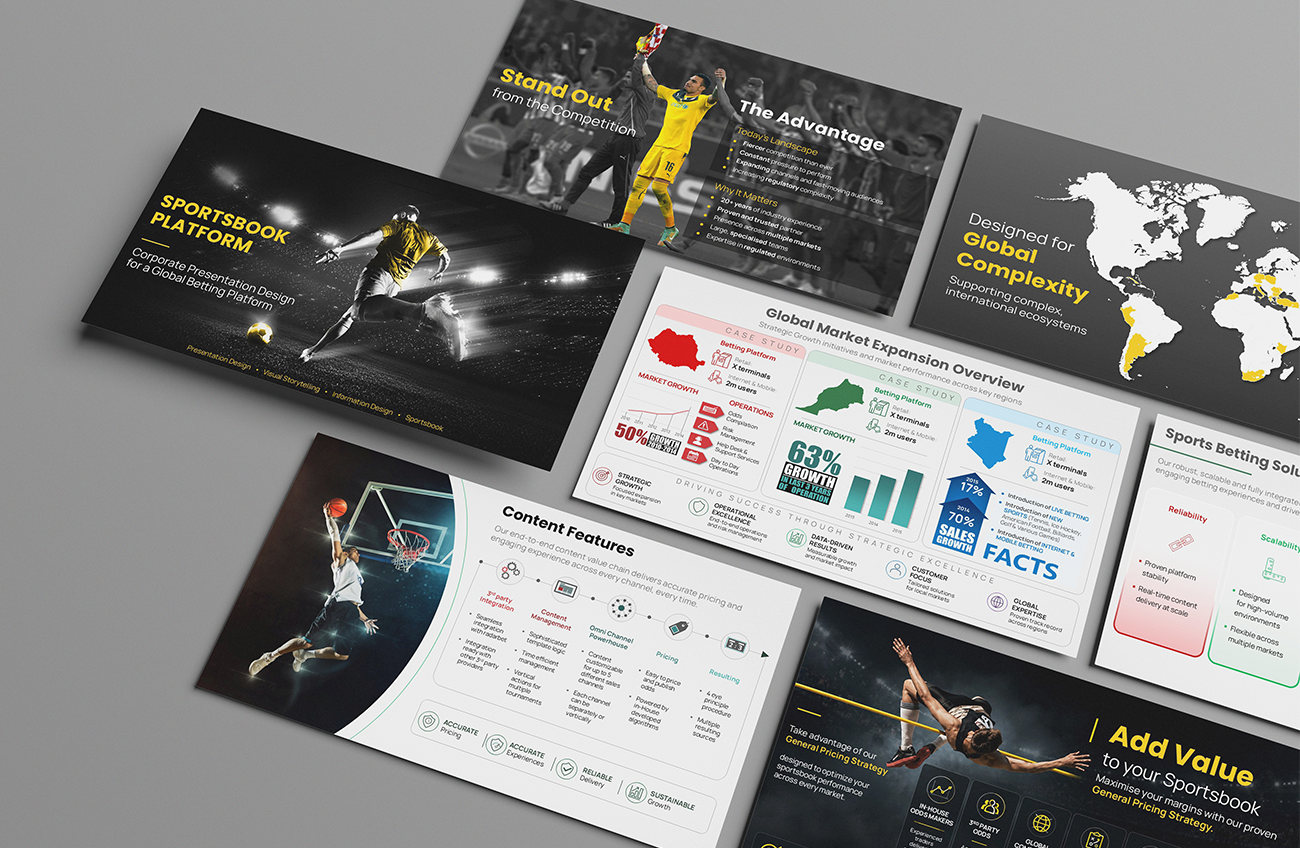
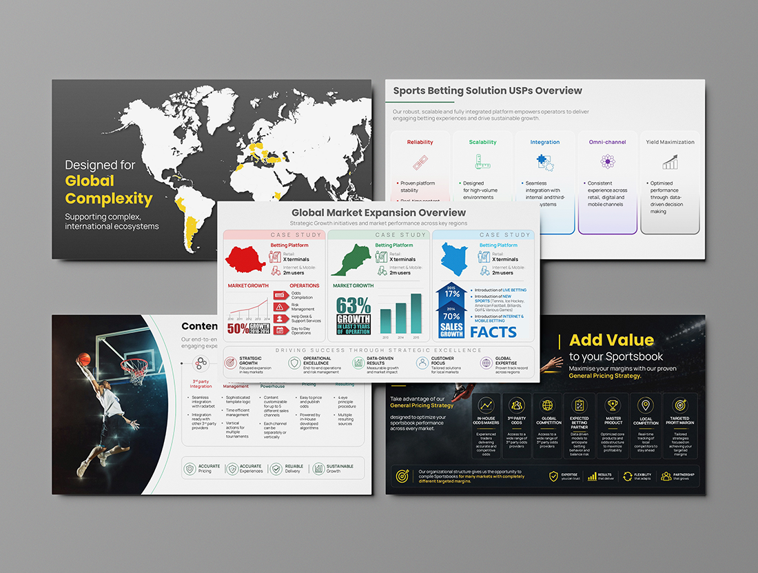
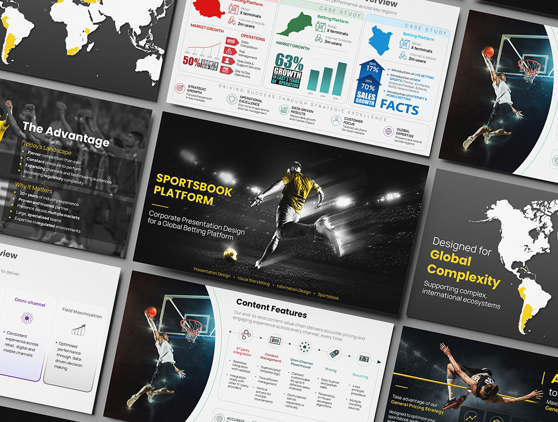
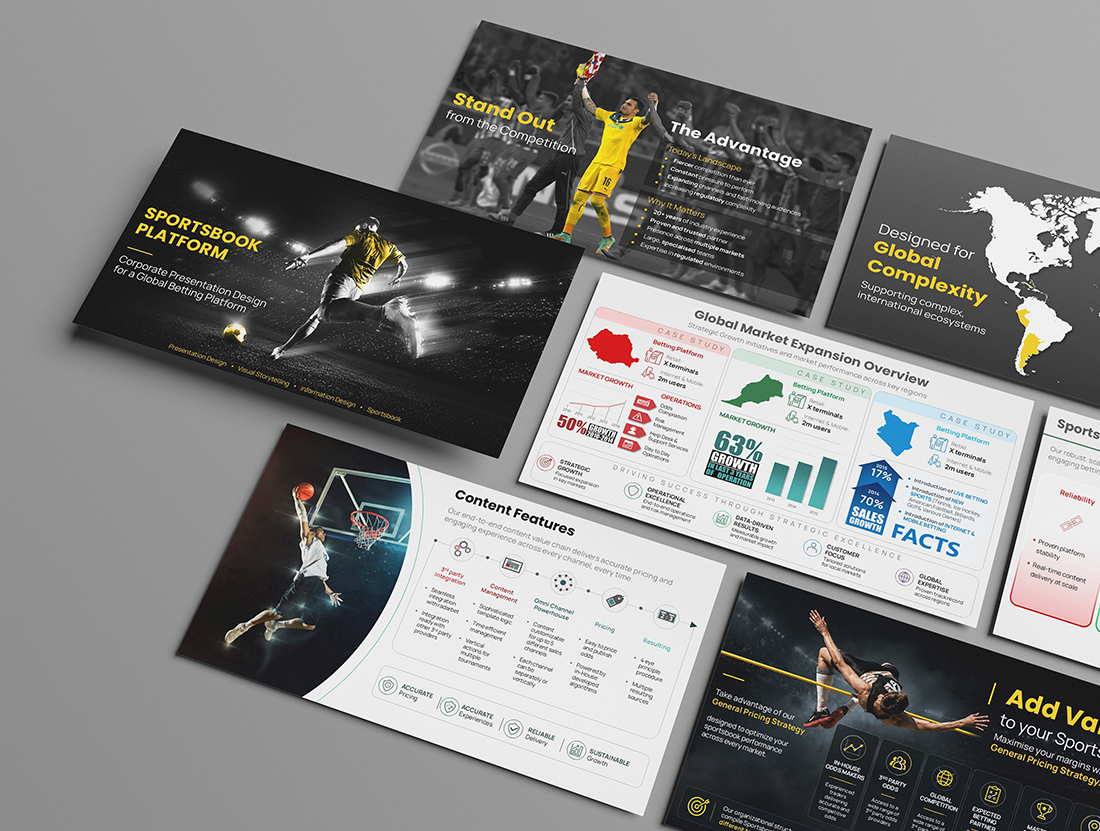
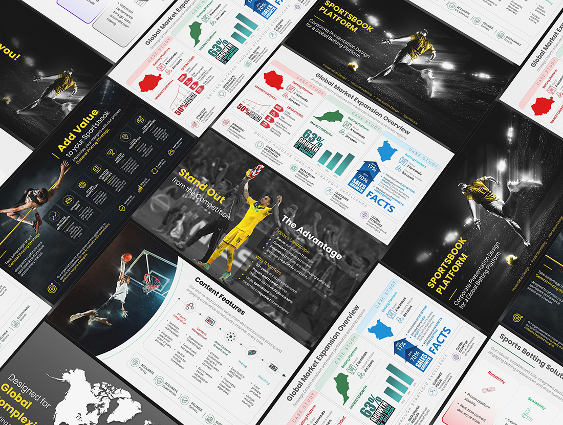
A presentation can contain valuable information and still feel difficult to follow. That was the challenge behind this sportsbook project: the content was detailed and important, but it needed a clearer structure and a stronger visual flow to work effectively in sales conversations.
The redesign focused on giving each slide a clear purpose. Information was reorganised, key messages were brought forward, and custom infographics were used where a visual explanation could communicate an idea more quickly than a block of text. Consistent typography, spacing and graphic elements helped the whole presentation feel connected rather than like a collection of separate slides.
The goal was not simply to make the presentation look more polished. It was to make complex information easier to understand, easier to present and easier to remember. Because good presentation design should never compete with the message—it should help the message come through clearly.